
Key Takeaways
- CSS controls the visual presentation and layout of HTML or other markup-based documents, including typography, spacing, colors, positioning, and effects.
- HTML supplies webpage structure and content, while CSS handles presentation, allowing the same underlying elements to be restyled without rewriting them.
- CSS supports responsive design through media queries, relative units, Flexbox, CSS Grid, and adaptable properties that adjust layouts across screen sizes.
- CSS rules use selectors, properties, and values, while the cascade resolves conflicts when multiple declarations target the same element.
CSS (Cascading Style Sheets) is a style sheet language used to control the visual presentation and layout of webpages written in HTML or other markup languages. It determines how page elements appear, including their colors, fonts, sizes, spacing, positioning, borders, backgrounds, and behavior across different screen sizes. MDN describes CSS as a language for specifying how documents are presented and styled.
HTML and CSS perform different roles. HTML provides the content and structure of a webpage, while CSS controls how that structure looks. Separating content from presentation allows the same HTML to be restyled without rewriting the underlying headings, paragraphs, links, images, and other page elements.
CSS works by targeting HTML elements and assigning visual rules to them. For example:
/* Targets all paragraph elements */
p {
  color: blue;
  font-size: 16px;
  line-height: 1.5;
}
Here, p targets paragraph elements, while color, font-size, and line-height determine how those paragraphs appear.
flex: A shorthand property controlling how a Flexbox item grows, shrinks, and uses available space.
justify-content: Controls how available space is distributed between or around content. In Flexbox, it works along the main axis; in Grid, along the inline axis.
place-content: A shorthand for controlling how content is aligned and distributed within Grid and certain multi-line Flexbox layouts.
flex-wrap: Controls whether Flexbox items stay on one line or move onto additional lines when space becomes limited.
grid-template-columns: Defines the number and sizes of columns in a CSS Grid layout.
em and rem: Relative units based on font sizing. rem uses the root element’s font size, while em depends on the relevant font-size context.
vw and vh: Viewport-relative units. 1vw represents 1% of viewport width and 1vh represents 1% of viewport height.
%: A relative percentage value whose reference depends on the CSS property being used.
px, cm, and pt: Absolute CSS units. px represents CSS pixels, while cm and pt are standardized length units.
padding: Controls the space between an element’s content and its border.
margin: Controls space outside an element’s border and separates it from surrounding elements.
gap: Sets spacing between rows, columns, or items in layouts such as Grid and Flexbox.
max-width and max-height: Set the maximum width or height an element is allowed to reach.
min-width and min-height: Set the minimum width or height below which an element should not normally shrink.
aspect-ratio: Defines a preferred proportional relationship between an element’s width and height, such as 16 / 9.
z-index: Helps determine which overlapping elements appear in front of or behind others within the relevant stacking context.
position: sticky: Lets an element scroll normally until a specified position is reached, after which it can remain fixed within its scrolling container.
overflow: Controls what happens when content extends beyond the space available inside an element.
text-overflow: Controls how clipped text is represented when it exceeds its available space, such as with an ellipsis.
color, width, or font-size.
blue in color: blue.
color: blue;.
.button.
id value and begins with a hash symbol, such as #main-header.
The 1994 CSS Proposal
Norwegian web pioneer Håkon Wium Lie published his original Cascading HTML Style Sheets proposal on October 10, 1994, while working at CERN. The proposal explored a system for separating and combining webpage presentation preferences, and CSS later became a W3C web standard.
HTML, CSS, and JavaScript
HTML, CSS, and JavaScript commonly work together to create modern webpages, but each has a different primary role.
For example, HTML might create a button, CSS can determine its color, size, spacing, and shape, and JavaScript can specify what happens when the button is clicked or activated.
Although CSS is most commonly associated with HTML webpages, it can also style other markup-based documents.
What Can CSS Do?
Modern CSS controls much more than fonts and colors. It can manage most aspects of how webpage elements are arranged and visually presented.
CSS can:
- position and organize elements using layout systems such as Flexbox and CSS Grid;
- control typography, including font families, sizes, weights, alignment, and line spacing;
- apply colors, gradients, background images, borders, and visual effects;
- manage margins, padding, dimensions, and gaps between elements;
- create transitions, transformations, and animations;
- control visibility, overflow, stacking, and overlapping elements;
- adjust layouts according to screen size, orientation, or other device characteristics.
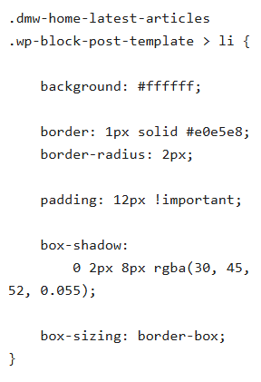
CSS Box Model
Browsers generally represent page elements as boxes. The CSS box model describes how an element’s content, padding, border, and margin work together to determine its visible size and surrounding space.
Responsive Design
CSS is a central part of responsive web design, which allows the same webpage to adapt to phones, tablets, laptops, desktop monitors, and other displays.
For example, a desktop layout might display three content columns side by side, while CSS can rearrange those same columns into a single vertical stack on a smaller mobile screen.
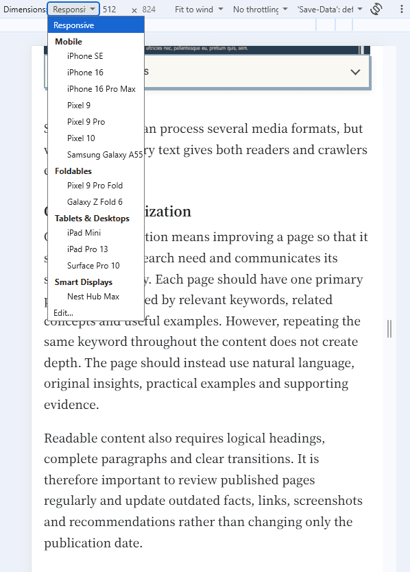
Media Queries: Media queries allow styles to change when particular conditions are met, such as a maximum viewport width. For example, a media query can switch a three-column desktop layout to a single-column layout when the viewport becomes narrower than 768 pixels, allowing the page design to adapt to different screen sizes.
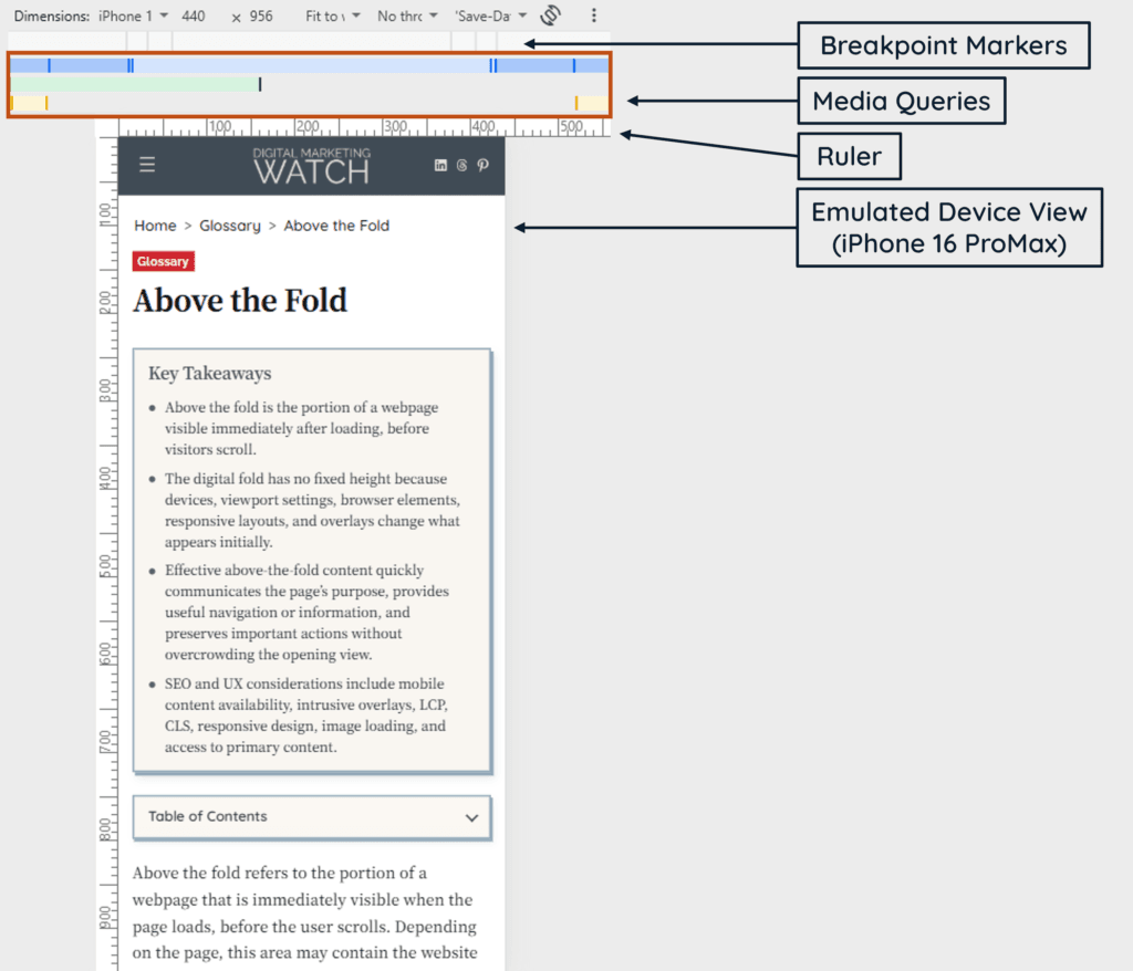
CSS Grid and Flexbox: CSS Grid and Flexbox are layout systems designed to arrange and align webpage elements flexibly. Grid is particularly useful for layouts involving rows and columns, while Flexbox is well suited to arranging elements along a row or column and allowing them to resize, align, or wrap as available space changes.
Relative CSS Units: Relative units allow dimensions and spacing to adapt according to another measurement or the viewport. Percentage values (%) depend on the property being used, em and rem scale according to font sizing, while vw and vh represent percentages of the viewport’s width and height. For example, width: 80% creates a flexible width, while font-size: 2rem makes text twice the root element’s font size.
CSS Properties: Responsive layouts commonly use properties such as width, max-width, min-width, display, flex-wrap, grid-template-columns, gap, font-size, and aspect-ratio. For example, max-width: 100% can prevent an image from extending beyond its container, while flex-wrap allows Flexbox items to move onto additional rows when there is no longer enough horizontal space.
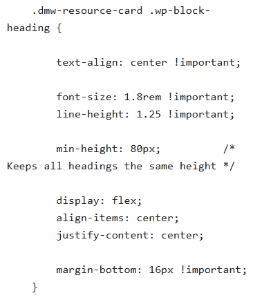
Selectors: Selectors do not make a design responsive by themselves; they identify which elements receive responsive styles. Element, class, ID, attribute, and other selectors can all be used within media queries or other responsive CSS rules.
Responsive design can also involve HTML features such as viewport settings and responsive image markup, so CSS forms an important part of the overall responsive system rather than handling every aspect alone.
How CSS Rules, Selectors, Properties, and Values Work
CSS instructions are generally written as rules. A simple CSS rule follows this structure:
selector {
  property: value;
}
For example:
.highlight-text {
  color: red;
  font-size: 20px;
}
The parts have different purposes:
.highlight-textis the selector. It identifies which HTML elements should receive the styles.colorandfont-sizeare properties. They identify the visual characteristics being changed.redand20pxare values. They determine how those properties should be applied.
A property and its value together form a CSS declaration.
Common CSS Selectors
A selector identifies the HTML element or group of elements to which a CSS rule applies. Common CSS selectors include:
- Element or Type Selector: An element selector targets every instance of a particular HTML tag. For example,
p { color: blue; }applies the rule to all paragraph (<p>) elements on the page. - Class Selector: A class selector targets any element assigned a particular
classvalue and begins with a period (.). For example,.btn-submit { background-color: blue; }can style an element such as<button class="btn-submit">Submit</button>. - ID Selector: An ID selector targets the element with a specific
idvalue and begins with a hash (#). For example,#main-header { position: sticky; }targets an element such as<header id="main-header">, and IDs are generally intended to be unique within a page. - Attribute Selector: An attribute selector targets elements based on the presence or value of an HTML attribute. For example,
input[type="text"] { border: 1px solid; }applies only to text input fields rather than every<input>element. - Pseudo-class Selector: A pseudo-class selector targets an element when it is in a particular state or position. For example,
a:hover { text-decoration: underline; }applies the style when a user hovers over a link.
CSS Units
CSS values can use several types of measurement. These include:
- Absolute Units: Absolute units include values such as
px,cm, andpt. They specify measurements without directly depending on another CSS value. - Relative Units: Relative units calculate their size in relation to another measurement or to the viewing environment. Common examples include
em,rem,%,vw, andvh.
Relative measurements are particularly useful when building flexible and responsive layouts.
Why Is It Called “Cascading”?
Multiple CSS rules can target the same element and sometimes provide conflicting declarations. The cascade is the system the browser uses to determine which declaration ultimately applies.
Factors such as the source of the style, importance, specificity, cascade layers, and source order can influence the result. The CSS Cascade specification defines how these competing declarations are resolved.
CSS also uses inheritance. Some properties, such as color, can inherit their computed value from a parent element when no value is specified on the child, while other properties do not inherit by default.
How to Apply CSS Styling to HTML
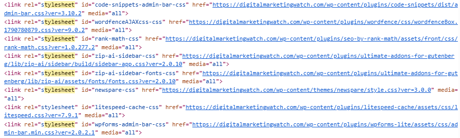
CSS can be connected to HTML in three common ways: external, internal, and inline.
External CSS
External CSS is stored in a separate stylesheet, commonly with a .css extension, and linked from the HTML document.
<link rel="stylesheet" href="styles.css">This is generally the most maintainable approach for larger websites because one stylesheet can provide consistent design rules across many pages.
Internal CSS
Internal or embedded CSS appears inside a <style> element, normally within the <head> of one HTML document.
<style>
  p {
    color: blue;
  }
</style>
It can be useful when styles apply only to a particular page or document.
Inline CSS
Inline CSS is added directly to an individual HTML element using the style attribute.
<p style="color: blue;">Example text</p>Inline styling is valid CSS, but it generally becomes difficult to maintain across large websites because presentation rules are mixed directly into individual HTML elements.
Adding CSS in WordPress
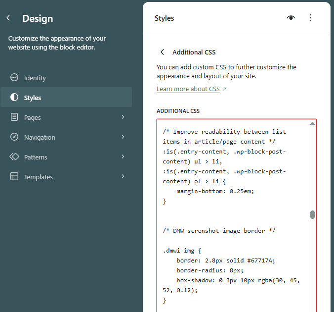
WordPress also provides interfaces for applying custom CSS without manually editing theme files. With block themes, site-wide custom CSS can be added through the Styles interface and its Additional CSS option. Classic themes commonly provide Appearance → Customize → Additional CSS.
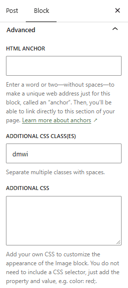
Individual blocks can also expose styling controls or additional CSS classes through the WordPress editor. The exact interface can differ according to the theme and WordPress version.
Common CSS Properties
CSS defines many properties covering layout, typography, interaction, animation, and visual presentation. Some frequently used examples include:
display, width, height, position, z-index, aspect-ratio
margin, padding, gap
font-family, font-size, line-height, text-align, text-shadow
color, background-color, background-image, opacity
border, border-radius, box-shadow, filter
cursor, pointer-events, user-select
overflow, text-overflow
place-content, justify-content, align-items
mix-blend-mode
Some commonly seen CSS declarations pair a property with a particular value. For example, position: sticky uses the position property with the sticky value, while text-overflow: ellipsis uses ellipsis as the value of the text-overflow property.
Likewise, place-content does not automatically center content. It is a shorthand property for controlling content alignment and distribution; a value such as center can be used when centering is required.
Frequently Asked Questions
What are selectors and properties in CSS?
A CSS selector identifies the HTML element or elements that should receive a style, while a property identifies the characteristic being changed, such as color, width, font size, or spacing. Each property is assigned a value that determines how the style should appear.
What are relative units in CSS?
Relative CSS units calculate their size according to another measurement or the viewing environment. Examples include em, rem, %, vw, and vh, and they are commonly used to create flexible layouts and scalable typography.
How does CSS help implement responsive design?
CSS can change layouts according to screen size and other device conditions using media queries, relative sizing, flexible units, CSS Grid, Flexbox, and related techniques. This allows the same page to present its content appropriately across mobile, tablet, and desktop displays.
What does “cascading” mean in CSS?
“Cascading” refers to the system browsers use to resolve competing style declarations when several CSS rules apply to the same element. Factors including origin, importance, specificity, and source order help determine which declaration ultimately takes effect.