
Key Takeaways
- Image optimization balances file size with visual quality, dimensions, functionality, and accessibility required for each image’s purpose.
- Effective optimization combines resizing, compression, suitable formats, responsive delivery, loading behavior, caching, and delivery infrastructure.
- Optimized images can improve loading performance, support Core Web Vitals, reduce bandwidth use, and provide better experiences across devices.
- Explicit dimensions, meaningful alt text, descriptive filenames, and appropriate loading priorities support accessibility, layout stability, and image understanding.
Image optimization is the process of preparing and delivering website images so that they use as little data as reasonably possible while preserving the visual quality, dimensions, and functionality required for their purpose. It involves more than compression. Image dimensions, file formats, responsive delivery, loading behavior, caching, accessibility, and delivery infrastructure can all affect how efficiently an image performs.
Large or poorly optimized images can substantially increase webpage weight and loading time. Images are often a major part of Largest Contentful Paint (LCP), while images without properly defined dimensions can contribute to layout shifts.
The objective is therefore not simply to make every file smaller. Effective image optimization means serving the right image, at an appropriate quality and size, in the right format, and at the right time. This becomes increasingly important as a website grows and the same images begin appearing across articles, cards, archive pages, product listings, search results, and different device sizes.
The video below demonstrates WebP images being loaded progressively as they approach the viewport during scrolling.
Why Image Optimization Matters for SEO
Image optimization primarily improves performance and usability, but several benefits also support search visibility.
- Faster Page Delivery: Properly sized and compressed images require less data to download, helping visible content appear sooner.
- Better Core Web Vitals: A properly optimized LCP image can load faster, while specifying image dimensions helps the browser reserve space and reduce unexpected layout shifts. Google’s responsive-image guidance confirms that serving an appropriately sized LCP image can reduce resource load duration and loading time.
- Better User Experience: Efficient images consume less bandwidth and are particularly helpful on slower mobile connections or limited data plans.
- Improved Accessibility: Meaningful alternative text helps people who cannot see an informative image understand its purpose. Google also uses alt text and surrounding content to better understand image subject matter.
- Easier Content Scaling: Consistent formats, sizes, naming conventions, and optimization workflows become increasingly valuable as hundreds or thousands of images accumulate.
- Better Multi-Device Delivery: A featured image may appear as a large article header, homepage card, related-post thumbnail, or image-search result. Responsive images allow the browser to receive an appropriately sized version instead of unnecessarily downloading the largest file everywhere.
Recommended Image Dimensions and File Sizes
Unlike social media graphics, ordinary website images generally do not have one mandatory pixel dimension. Their dimensions should reflect the largest size at which they are expected to appear. Standardized dimensions and aspect ratios become more important for reusable components such as featured images, thumbnails, product cards, banners, and archive layouts.
The following figures are practical starting targets rather than technical standards.
Uploading a 4,000-pixel-wide photograph for an 800-pixel content column still wastes resources unless the site generates and delivers smaller alternatives. Responsive images solve much of this problem. The srcset attribute provides alternative image files, while sizes helps the browser choose the version appropriate for the current layout and device.
Image Optimization Techniques
A complete image optimization process combines file preparation, responsive delivery, loading behavior, accessibility, and caching rather than relying on one compression tool.
1. Choose the Appropriate Image Format
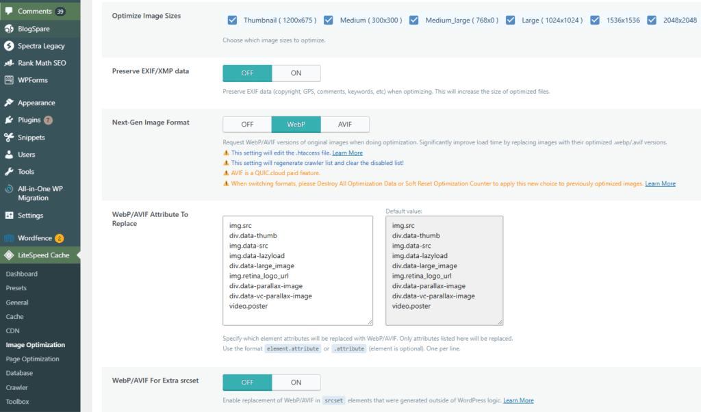
Different formats are suited to different purposes. WebP and AVIF work well for photographs and many general website graphics, while SVG is particularly suitable for scalable logos, icons, diagrams, and other vector graphics.
PNG remains useful when exact raster detail or transparency is important, while JPEG can still be appropriate for photographic workflows. Modern browsers widely support WebP and AVIF. Users must consider format support and specific capabilities when selecting newer formats.
2. Resize Images for Their Actual Layout
Do not upload substantially more image data than the layout can reasonably use. A photograph displayed at 800 pixels wide generally does not need to be served as the same 4,000-pixel original.
Two measurements should be distinguished:
- Intrinsic dimensions describe the actual pixel dimensions of the source image.
- Displayed dimensions describe how large the image appears in the page layout.
High-density displays may justify delivering more pixels than the CSS display width, but excessive dimensions still create unnecessary file weight.
3. Apply Lossy or Lossless Compression
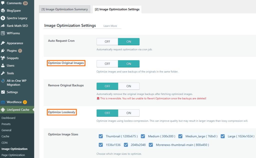
Lossless compression reduces file size while preserving the information necessary to reproduce the original image exactly. Removing unnecessary EXIF data, such as camera information or GPS metadata, can sometimes reduce the file further.
Lossy compression deliberately removes selected image information to achieve greater file-size reduction. It is particularly effective for photographs, where moderate compression may be difficult to notice visually.
There is no universal quality percentage that works for every image. Screenshots containing text, product photography, gradients, illustrations, and photographs can all respond differently to the same compression setting.
In WordPress, image optimization plugins such as Smush, Imagify, or LiteSpeed Cache can automate compression, with the available compression methods and settings varying by plugin and plan.
Resizing vs. Compression
Resizing and compression reduce image file size in different ways. Resizing lowers the actual pixel dimensions of an image—for example, reducing a 4000 × 3000 image to 1200 × 900 when the larger version is unnecessary.
Compression keeps the image dimensions the same but reduces the amount of data needed to store the image, usually by encoding it more efficiently or removing some visual information. Good image optimization often combines both techniques.
4. Specify Image Width and Height
Include explicit width and height attributes when possible:
<img
  src="running-shoes.webp"
  alt="Blue running shoes"
  width="800"
  height="600">
These attributes give the browser the image’s aspect ratio before the file finishes loading, allowing it to reserve appropriate layout space. CSS can still resize the image responsively. This helps reduce unexpected movement that can contribute to Cumulative Layout Shift (CLS).
5. Serve Responsive Images With srcset, sizes, and <picture>
Sending the same desktop-sized image to every mobile device wastes bandwidth. Responsive images provide several versions and allow the browser to choose one based on layout width and device characteristics.
For example:
<img
  src="product-800.webp"
  srcset="product-400.webp 400w,
          product-800.webp 800w,
          product-1200.webp 1200w"
  sizes="(max-width: 600px) 100vw, 800px"
  alt="Blue running shoe"
  width="800"
  height="600">
The <picture> element is useful when a different crop, format, or image source is needed under particular conditions. For example, a wide desktop banner may use a tighter portrait crop on mobile. Google supports standard <img> elements with srcset and images contained within <picture> and recommends retaining a src fallback.
6. Lazy-Load Below-the-Fold Images
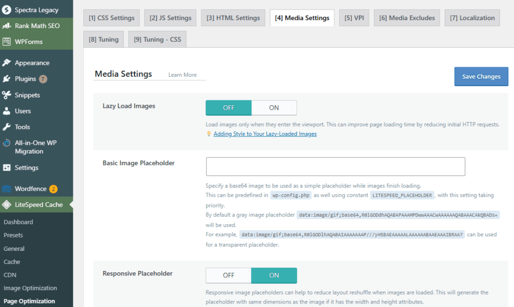
Lazy loading delays non-critical offscreen images until they approach the viewport. It is especially useful for long articles, galleries, product listings, and other image-heavy pages.
Do not lazy-load an important above-the-fold or LCP image. Critical images should be available immediately, while loading="lazy" is better suited to resources farther down the page.
7. Optimize Alt Text and File Names
Informative images should have concise alternative text that describes their relevant content or purpose. Decorative images may appropriately use an empty alt attribute instead.
Descriptive filenames such as blue-running-shoes.webp are also preferable to names such as IMG4827.webp. Google states that filenames can provide hints about the image’s subject matter and identifies alt text as particularly important for image context and accessibility.
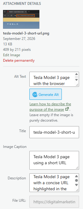
Captions or longer descriptions should be added when they genuinely help readers rather than as a routine SEO requirement.
8. Prioritize Important LCP Images
Prominent hero, featured, or product images are often appropriate LCP candidates. These images should load early rather than being deferred.
An important LCP image can sometimes benefit from:
<img
  src="hero.webp"
  width="1600"
  height="900"
  fetchpriority="high"
  alt="...">
fetchpriority="high" gives the browser an additional priority hint. Preloading is more appropriate when a critical image would otherwise be discovered late, such as certain CSS background images or dynamically introduced resources:
<link
  rel="preload"
  as="image"
  href="hero-banner.webp"
  fetchpriority="high">
Preload should not automatically be added to every hero image. If an important image is already discoverable early in the HTML, normal browser discovery combined with appropriate fetch priority may be preferable.
9. Enable Browser Caching
Appropriate caching allows browsers to reuse unchanged image resources on subsequent visits rather than downloading the same files repeatedly. Long cache lifetimes are particularly suitable for versioned image files that change URLs when their contents change.
In WordPress, browser caching can be enabled through plugins such as LiteSpeed Cache:
LiteSpeed Cache → Cache → Browser, enable Browser Cache, and set the Browser Cache TTL (Time to Live).
LiteSpeed recommends a long TTL for static files such as images.
10. Use a Content Delivery Network (CDN)
A CDN can be set up by connecting the website to a CDN service, usually through DNS settings, a hosting panel, or a WordPress plugin. Once configured, a CDN can cache and serve image files from edge locations closer to visitors, reducing the distance those resources must travel.
On WordPress, CDN setup depends on the provider and may be handled through a hosting panel, provider plugin, or caching/performance plugin such as LiteSpeed Cache or WP Rocket.
Many image CDNs can also be configured to resize, compress, and convert images automatically.
11. Configure Images for Social Sharing
Open Graph metadata can identify the image that social platforms should use when a page is shared. For example, og:image can point to a suitable representative image.
This is not a file-size optimization technique, but it is part of managing how website imagery is distributed across different platforms. Google also recognizes og:image as one way of identifying a representative page image in relevant contexts.
How to Automate Image Optimization
Manually resizing and compressing every asset becomes impractical on larger websites. Many content management systems and optimization services can automate at least part of the process.
WordPress
Plugins such as Imagify, Smush, ShortPixel, and LiteSpeed Cache can reduce manual image-processing work and provide combinations of compression, next-generation formats, responsive delivery, or related optimization features.
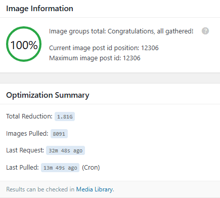
LiteSpeed Cache uses its image optimization service rather than simply converting every upload locally. A typical initial process is:
LiteSpeed Cache → Image Optimization → Send Optimization Request → images are processed → optimized files are pulled back to the website.
Automatic processing can then be enabled through Auto Request Cron. In LSCWP v7, Auto Pull Cron is deprecated because optimized images are pulled automatically by default.
Wix and Shopify
Wix performs image optimization through its built-in media infrastructure and currently documents automatic AVIF compression for supported site images.
Shopify provides image processing and CDN delivery through its image tools. Themes can use Shopify’s image_tag and image_url filters with srcset and sizes to generate appropriately sized responsive images rather than serving one large source everywhere.
Files can also be optimized before upload with tools such as Squoosh, TinyPNG, or TinyJPG, particularly when more manual control over quality is required.
How to Check Whether Images Are Properly Optimized
Image optimization should be verified through practical testing rather than assumed from the file format alone.
- Run PageSpeed Insights or Lighthouse: Enter the page URL in PageSpeed Insights, or open the webpage in Chrome and press F12 or Ctrl + Shift + I to open DevTools. Select Lighthouse → Analyze page load, then review image-related findings involving LCP, oversized images, loading priority, and layout shifts.
- Inspect Browser Network Requests: Open DevTools with F12 or Ctrl + Shift + I, select Network, click Img to show only image requests, and refresh the page with Ctrl + R. Review the Size, Type, and loading order to identify unnecessarily large images or unexpected formats.
- Check Responsive Delivery: Open DevTools and press Ctrl + Shift + M to activate the device toolbar. Select different phone, tablet, and desktop widths, reload the page, and use Network → Img to confirm that smaller screens receive appropriately sized image files instead of the same large desktop version.
- Inspect Image Markup: Right-click an image and select Inspect, or press Ctrl + Shift + I and locate the image in the Elements panel. Check for relevant attributes such as
width,height,alt,srcset,sizes,loading, andfetchpriority; Ctrl + U can also open the page source for checking image markup directly.
Frequently Asked Questions
Do all browsers support WebP or AVIF?
Current major browsers provide broad support for WebP and AVIF, although compatibility can differ in older versions or particular environments. A <picture> element can provide alternative sources or fallbacks when compatibility requirements justify them.
What is the ideal file size for a web image?
There is no universal ideal file size. A small icon or thumbnail may require only a few kilobytes, while a detailed hero image, infographic, screenshot, or product photograph may reasonably require more. The goal is to use the smallest file that preserves the quality required for its purpose.
Does image optimization affect visibility in Google Images?
It can support image-search visibility and performance, but compression alone does not make an image rank. Google recommends crawlable HTML image elements, relevant surrounding content, meaningful alt text, descriptive filenames, responsive implementation, and other image SEO practices that help it discover and understand images.
Should I always choose lossy compression over lossless compression?
Lossy compression is often appropriate for photographs because substantial savings can be achieved with limited visible degradation. Lossless compression is more suitable when exact reproduction, crisp text, sharp edges, interface details, or precise graphics must be retained.
What happens if width and height are missing from image tags?
The browser may have less information available to reserve the correct amount of space before the image loads, which can contribute to layout movement. Explicit width and height attributes establish the image’s intrinsic aspect ratio and are therefore a useful technique for preventing image-related layout shifts.