
Key Takeaways
- Mobile-first indexing means Google primarily uses a webpage’s mobile-rendered content for indexing and ranking through Googlebot Smartphone.
- Google maintains one Search index, not separate mobile and desktop indexes.
- Responsive web design generally provides the simplest configuration by adapting the same URL and core HTML across screen sizes.
- Mobile versions should preserve important content, headings, internal links, metadata, structured data, images, and crawlable interactive content.
Mobile-first indexing means that Google relies primarily on the mobile version of a website when indexing content and determining rankings. Google Search crawls websites mainly with Googlebot Smartphone, a crawler that simulates a person accessing a page on a mobile device.
Google did not always work this way. Historically, its ranking systems generally evaluated the desktop version of a page. This created problems, especially when a mobile page contained less information than its desktop equivalent. Google therefore began experimenting with mobile-first indexing in 2016 and gradually moved websites to smartphone-based crawling.
Mobile-first indexing does not mean that Google maintains distinct mobile and desktop search indexes. Google has one Search index; “mobile-first” describes which version of a page Google primarily uses when gathering information for that index. The same indexed information can then support search results on both mobile and desktop devices.
Many modern websites use responsive web design, where the same URL and core HTML are served across devices while CSS adapts the layout to fit different screen sizes. Google recommends responsive design because it is generally the easiest mobile configuration to implement and maintain.
A Brief History of Mobile-First Indexing
Mobile-first indexing was introduced through a gradual transition rather than a single algorithm update.
- April 2015: Google launched its mobile-friendly update, widely nicknamed Mobilegeddon, which helped improve the rankings of mobile-friendly pages in mobile search results. This was not yet mobile-first indexing.
- November 2016: Google announced its first mobile-first indexing experiments. At the time, its ranking systems still typically evaluated desktop content.
- March 2018: Google began a broader mobile-first indexing rollout for sites considered ready.
- December 2018: Google reported that more than half of pages shown globally in Search results were using mobile-first indexing.
- July 2019: Mobile-first indexing became the default for new websites previously unknown to Google.
- March 2020: Google said about 70% of sites shown in Search had moved to a mobile-first indexing system and initially planned to complete the transition in September 2020.
- July 2020: Google extended the transition to March 2021 while remaining technical issues were addressed.
- November 2021: Google removed the fixed completion date after finding that some sites still faced difficult technical problems. Its 2021 indexing update left the final timeline open.
- October 2023: Google announced that the mobile-first indexing migration was complete, apart from a very small number of sites that did not work properly on mobile devices.
- July 2024: Google completed the remaining crawler transition by moving sites still crawled with desktop Googlebot to Googlebot Smartphone for Search. Content completely inaccessible on mobile devices could no longer be indexed.
Googlebot Smartphone vs. Googlebot Desktop
Googlebot is Google’s web crawler. Googlebot Smartphone simulates a user on a mobile device, while Googlebot Desktop simulates a user browsing on a desktop computer. Google still operates both crawlers, but Googlebot Smartphone now performs the primary crawling used for Search indexing.
Googlebot Desktop can still appear in server logs. Google says it may be used for certain specialized purposes, including some crawling for product listings and Google for Jobs.
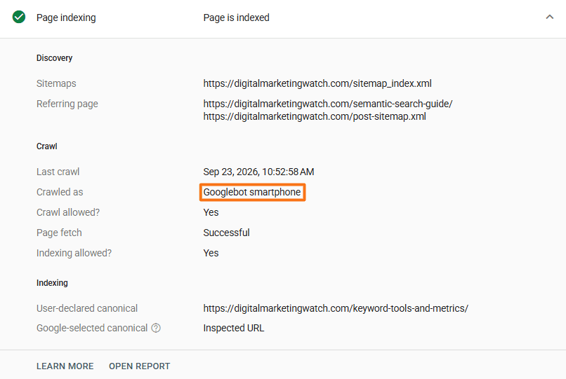
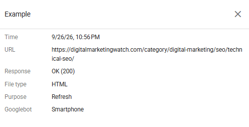
For an individual URL, Google Search Console’s URL Inspection information can show whether a crawl used a smartphone or desktop user agent.
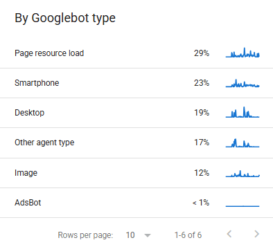
The Crawl Stats report can also show crawler types making requests to the site.
Bing and Mobile-First Indexing
Microsoft documents both mobile and desktop Bingbot user-agent strings. In its 2015 Mobile Friendliness Test documentation, Bing evaluated factors such as text readability, content width, viewport configuration, and spacing between links and other elements. These mobile-friendliness practices should not, however, be treated as evidence that Bing uses Google’s specific mobile-first indexing model.
Why Optimizing Pages for Mobile Users Helps in General
Mobile-first indexing explains why the mobile version matters specifically to Google Search, but mobile optimization has much broader benefits. Smartphones with touch-friendly screens are widely used for browsing, searching, reading, shopping, communicating, and completing transactions, so webpages need to work comfortably on smaller displays regardless of how search engines index them.
Serve Mobile Visitors Effectively
A page designed only for a wide desktop screen can cause horizontal scrolling, difficult navigation, unreadable text, or controls that are awkward to use on a phone. Responsive layouts allow the same information to adapt more naturally to different screen sizes.
Improve the Mobile User Experience
Mobile-friendly pages make content easier to read and interact with. Text should remain legible, navigation should be simple, and buttons and links should have enough size and spacing for touch input. Forms, menus, media, and other interactive elements should also work without repeated zooming or horizontal movement.
Support Search Visibility
Google relies primarily on the content it sees when crawling a page with Googlebot Smartphone for indexing and ranking. If important text, internal links, images, metadata, or structured data are absent from the mobile version, Google may have less information available to understand and index the page.
Mobile-first indexing and mobile usability are still separate concepts. A page can technically be crawlable and indexable on a smartphone while providing a poor experience to actual mobile visitors.
How to Optimize for Mobile-First Indexing
The central goal is to ensure that Googlebot Smartphone can access the important content, resources, and internal relationships that represent the page.
- Use Responsive Web Design: Where practical, use the same URL and HTML across devices while allowing CSS to adapt the layout to different screen sizes. Google recommends responsive web design over separate mobile URLs because it is generally easier to implement and maintain.
- Maintain Content and Heading Parity: Keep equivalent primary text, meaningful headings, images, videos, and important information available on mobile and desktop. The presentation can change for a smaller screen, but substantially reducing the mobile content can leave Google with less information to index.
- Preserve Important Internal Links: Category, product, article, hub, and contextual links that matter to the site’s structure should remain accessible on mobile. Removing important links solely to simplify the interface can make other pages harder for Googlebot Smartphone to discover.
- Keep Metadata and Structured Data Consistent: Maintain equivalent title elements, meta descriptions, robots directives, and relevant structured data across versions. Product, Article, LocalBusiness, and other applicable schema should not disappear from the mobile version. Google specifically recommends using the same structured data and metadata even when desktop and mobile versions differ.
- Preserve Images and Alt Text: Important images should remain available through crawlable URLs and at appropriate quality. Descriptive
altattributes should also be retained on mobile. Google has specifically warned that missing mobile alt text makes it harder for Google Images to understand image context. - Make Accordions and Interactive Content Crawlable: Accordions and tabs can be useful on small screens and are not inherently a mobile-first indexing problem. However, primary content should not be loaded only after someone clicks, swipes, or types, because Googlebot generally does not perform those interactions simply to reveal content.
- Improve Mobile Core Web Vitals: Compress oversized images, reduce unnecessary JavaScript, optimize fonts, use effective caching, and address loading, responsiveness, and layout-stability problems. Core Web Vitals and mobile-first indexing are different concepts, but better performance can substantially improve the experience of mobile visitors.
- Design for Touch Navigation: Use legible font sizes, adequate spacing, straightforward menus, and tap targets that are easy to select. Small links or closely packed buttons may technically remain crawlable while creating a frustrating experience for people using touchscreens.
Frequently Asked Questions
Does mobile-first indexing mean Google has two separate Search indexes?
No, Google uses one Search index. Mobile-first indexing means Google primarily uses the version of a page served to mobile users for indexing and ranking rather than maintaining separate mobile and desktop indexes.
What happens if a website does not have a mobile version?
A separate mobile website is unnecessary if the regular webpage works properly on smartphones. However, since July 2024, content that is completely inaccessible on mobile devices cannot be indexed by Google Search.
How can WordPress and Wix sites be optimized for mobile users?
WordPress and Wix sites can use responsive themes or templates, retain important content and internal links across screen sizes, optimize images and performance, and test important pages at mobile widths and on real devices. A separate mobile URL is normally unnecessary.
How does mobile-first indexing affect internal linking?
Google primarily uses the links available in the mobile version when crawling and indexing a page. If important internal links appear only on desktop, Google may have weaker discovery paths and less information about the site’s structure and page relationships.
Do mobile and desktop versions have the same URLs?
With responsive web design, mobile and desktop versions use the same URLs. Dynamic serving can also use the same URL while delivering different HTML, while separate mobile configurations may use different URLs such as m.example.com. Google generally recommends responsive web design where practical.