
Key Takeaways
- Above the fold is the portion of a webpage visible immediately after loading, before visitors scroll.
- The digital fold has no fixed height because devices, viewport settings, browser elements, responsive layouts, and overlays change what appears initially.
- Effective above-the-fold content quickly communicates the page’s purpose, provides useful navigation or information, and preserves important actions without overcrowding the opening view.
- SEO and UX considerations include mobile content availability, intrusive overlays, LCP, CLS, responsive design, image loading, and access to primary content.
Above the fold refers to the portion of a webpage that is immediately visible when the page loads, before the user scrolls. Depending on the page, this area may contain the website header, navigation, page title, introductory text, a featured or hero image, an important call to action, or other content needed to understand the page.
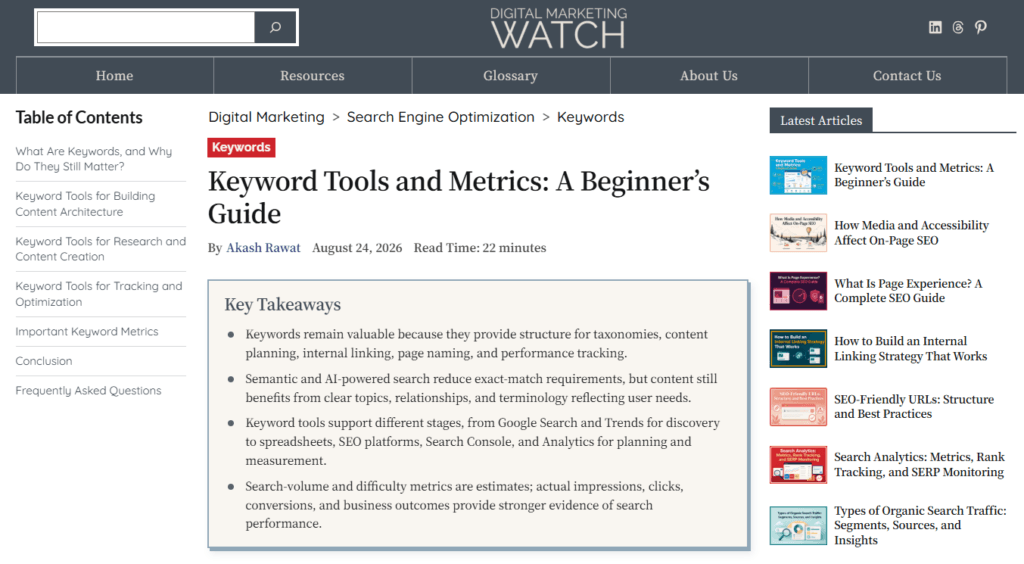
Above-the-fold content matters because it forms the visitor’s first view of the page. It should quickly communicate where the visitor has arrived, what the page is about, and what information or action is available next. This does not mean squeezing every important element into the first screen; the objective is to make the beginning of the page useful, clear, and easy to navigate.
Origin of “Above the Fold”
The expression comes from printed newspapers, which were traditionally folded in half when displayed on newsstands. Important headlines and photographs were often placed on the visible upper half—above the fold—to attract attention before the newspaper was opened.
The concept transferred naturally to websites, but the digital fold differs from its newspaper equivalent in one important respect: its position is not fixed.
The Above-the-Fold Area Is Fluid
There is no universal pixel height or standard dimension that defines the fold on a webpage. The amount of content visible when a page opens depends on the visitor’s screen size, viewport dimensions, aspect ratio, device orientation, browser interface, zoom level, font scaling, operating-system settings, and responsive layout.
Additional website elements can change it as well. A cookie notice, announcement bar, browser translation prompt, advertisement, or sticky header can consume part of the available viewport and move the main content farther down.
For example, on a large desktop display, an article might initially show the navigation, H1 heading, introductory paragraphs, and part of its featured image. On a smartphone, the same page may initially show only the compact header, title, and beginning of the introduction. Both views have an above-the-fold area, but the fold occurs at a different point.
This is one reason responsive web design is more useful than designing around an assumed fold such as 768 or 900 pixels. A responsive layout can resize text and images, stack columns, collapse navigation into a hamburger menu, reposition secondary elements, and adapt the page to the available screen.
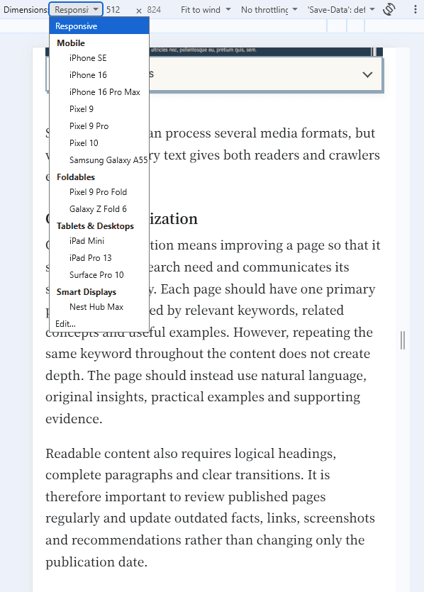
Mobile presentation is particularly important because Google uses the mobile version of a site’s content for indexing and ranking under mobile-first indexing.
The digital fold should therefore be treated as a flexible viewport boundary, not a fixed horizontal line built into the webpage.
Why Above-the-Fold Content Matters for SEO and UX
The first visible portion of a page influences both usability and several important performance considerations.
- Clear First Impression: Above-the-fold content should make the page’s subject and purpose immediately understandable. Excessive decorative space, vague slogans, or unrelated promotions can force visitors to scroll before finding the information they expected.
- Immediate Access to Main Content: Visitors should be able to reach the primary content without dismissing unnecessary overlays or navigating through large promotional areas. Google recommends avoiding intrusive interstitials and dialogs that obstruct the underlying content, particularly when visitors first arrive.
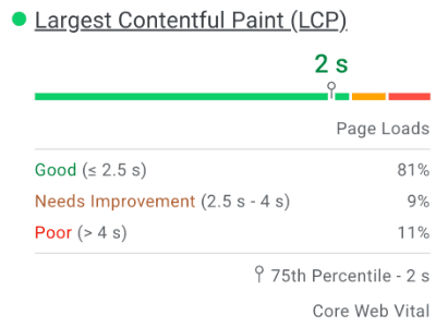
- Largest Contentful Paint (LCP): LCP measures the render time of the largest eligible image, text block, or video visible within the viewport. Because hero images, featured images, banners, and large text blocks frequently appear above the fold, their loading behavior can have a major effect on LCP. A good LCP is 2.5 seconds or less at the 75th percentile of page loads.
- Cumulative Layout Shift (CLS): Images, advertisements, embeds, banners, or other elements that appear late without reserved space can push visible content around after the page has started loading. This creates unexpected layout movement and can worsen CLS, which measures visual stability.
- Mobile Usability: Mobile screens provide considerably less visible space. Oversized headers, banners, advertisements, and pop-ups can therefore consume most of the initial viewport and delay access to the main content.
- Engagement and Navigation: Clear headings, useful introductory content, understandable navigation, and appropriate calls to action help visitors decide how to continue. Core Web Vitals, engagement, conversions, exits, and scroll depth can provide useful signals when evaluating the opening experience, although no single metric should determine whether an above-the-fold design is successful.
Core Web Vitals are used by Google’s ranking systems, but strong scores do not guarantee high rankings. Google recommends considering page experience holistically rather than optimizing one metric or interface element solely for SEO.
Above-the-Fold Optimization Best Practices
Above-the-fold optimization should prioritize fast access to useful content and functionality, rather than attempting to fit as many visual or promotional elements as possible into the initial viewport.
1. Never Lazy-Load Critical Above-the-Fold Images
Important hero, featured, product, or other immediately visible images should normally load without lazy loading. Lazy loading is better suited to images and other resources farther down the page.
This is especially important when an image is the LCP element. Web performance guidance explicitly warns against lazy-loading the LCP image because doing so can delay its request and worsen LCP.
2. Keep the Website Header Efficient
A header should provide branding and essential navigation without occupying an unnecessary amount of vertical space. On mobile devices, a hamburger menu can replace a large navigation row, while secondary functions such as search or social links can be simplified where appropriate.

The goal is not to make the header as small as possible, but to prevent it from overwhelming the page’s primary content.
3. Prioritize Critical Images When Necessary
An important image should be discoverable by the browser as early as possible. When an LCP image would otherwise be discovered late—for example, because it is referenced through CSS—preloading can help:
<link
  rel="preload"
  fetchpriority="high"
  as="image"
  href="hero-banner.webp"
  type="image/webp">
Preloading should not be added to every image automatically. If a critical image is already discoverable early in the HTML, unnecessary preload directives can compete with other important resources.
4. Maintain Important Mobile Content
Primary headings, text, images, links, and functionality should remain available on mobile rather than being removed simply to create a cleaner small-screen layout.
Responsive design can change how elements are arranged without removing information that is important to understanding or navigating the page.
5. Keep Important Actions Accessible
The appropriate above-the-fold action depends on the page’s purpose. A product page might display Add to Cart, while a service page may provide Request a Quote or Book an Appointment.

An informational article does not necessarily need a large CTA. A clear title, direct definition, and useful opening paragraphs may be more valuable than immediately asking readers to subscribe or take another action.
6. Avoid Intrusive Pop-Ups and Interstitials
Newsletter prompts, app-install promotions, advertisements, or other overlays should not cover most of the main content as soon as a visitor arrives.
Google recommends using smaller banners where appropriate so that the underlying content remains accessible rather than presenting full-page intrusive interstitials.
7. Prioritize Functionality Over Decoration
Above-the-fold space is limited. Oversized decorative images, animations, empty space, elaborate slogans, or design elements should not make the page’s actual purpose difficult to find.
Good visual design supports the content rather than delaying access to it.
8. Begin With the Main Answer or Purpose
Informational pages should introduce the subject directly rather than forcing readers through several paragraphs of generic background. Product and service pages should similarly communicate the main offering clearly before presenting secondary details.
Above-the-fold optimization is therefore partly an editorial consideration, not only a technical or design task.
9. Balance Advertising With Main Content
Advertisements can appear above the fold, but they should not dominate or obscure the page’s original content. Avoid excessive advertising that distracts from or interferes with the main content.

Space should also be reserved for ads that load dynamically so their appearance does not suddenly push surrounding content downward.
10. Optimize Initial Loading Performance
Compress and appropriately size images, minimize unnecessary third-party resources, and avoid unnecessary delays in loading critical CSS and JavaScript.
CSS and some JavaScript can be render-blocking, meaning the browser may need to download and process them before displaying the page. Non-critical resources can often be deferred while essential styling remains available for the initial render.
11. Monitor Performance and User Behavior
Use Core Web Vitals, organic traffic, engagement, scroll depth, exits, and conversions to understand how visitors interact with the page. Changes should be evaluated in context rather than assuming that moving one element above or below the fold will automatically improve performance.
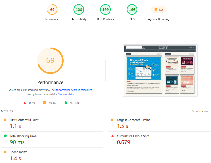
Use PageSpeed Insights and Lighthouse to test individual pages, Chrome DevTools Device Mode to inspect different viewport sizes, and Search Console’s Core Web Vitals report to monitor real-world performance across groups of URLs.
Frequently Asked Questions
What is the standard height or dimension for the digital fold?
There is no standard height or dimension for the digital fold. Its position changes according to viewport size, screen resolution, browser interface, orientation, zoom, accessibility settings, responsive design, and other elements occupying the initial screen.
What does “render-blocking resources” mean in PageSpeed Insights?
Render-blocking resources are CSS or JavaScript files that can delay the browser from displaying important page content because they must be downloaded and processed first. Chrome recommends identifying which CSS and JavaScript are critical for the initial render and deferring or removing unnecessary resources where appropriate.
What should be placed above the fold?
The above-the-fold area should normally contain the information visitors need first, such as clear branding and navigation, the page title, useful introductory content, an important image where relevant, and a primary action when the page requires one. The exact combination should reflect the purpose of the page rather than a fixed design formula.
Should ads be placed above the fold?
Yes, ads can appear above the fold, but they should not overwhelm, obscure, or make the main content difficult to access. Their dimensions should also be reserved where possible to prevent layout shifts, while advertising farther down the page can often be loaded later. Google recommends avoiding excessive ads that distract from or interfere with primary content.