
Key Takeaways
- Responsive design uses one URL and underlying HTML, with layouts, images, typography, and navigation adapting to available space.
- Fluid layouts, flexible media, viewport settings, media queries, Flexbox, and Grid help content resize, wrap, and reorganize across devices.
- Responsive design differs from adaptive design because it continuously adjusts to available space rather than switching among predefined layouts.
- Google recommends responsive design for easier mobile implementation and maintenance, but equivalent content, metadata, links, images, and structured data still must remain accessible.
Responsive design is a web development and design approach in which a webpage automatically adapts its layout, images, text, navigation, and other interface elements to different screen sizes, viewport dimensions, resolutions, and device orientations. The objective is to make the same website comfortable to use on smartphones, tablets, laptops, desktops, and other screen sizes without maintaining a separate version for each device.
Instead of using a desktop website and a separate mobile site such as https://m.example.com, responsive design normally uses one URL and the same underlying HTML, while CSS changes how the content is arranged and displayed according to the available space.
Responsive design commonly combines viewport settings, flexible layouts, responsive images, scalable typography, CSS media queries, Flexbox, and CSS Grid. Besides improving usability across devices, maintaining one responsive website can reduce development and maintenance complexity.
Responsive Design vs. Adaptive Design
Responsive design uses flexible layouts that continuously adjust to the available space. Adaptive design usually provides several predefined layouts and switches between them when the device or viewport reaches particular size ranges.
Core Components of Responsive Design
Responsive web design is often explained through three core components: fluid layouts, flexible media, and CSS media queries. Modern implementations also use responsive typography, viewport configuration, Flexbox, Grid, and responsive image delivery.
Fluid Layouts
Older website layouts commonly relied on rigid widths such as a 960px container. That approach can cause content to overflow or appear unnaturally small when the available screen becomes much narrower.
Responsive layouts allow columns and containers to grow, shrink, wrap, or reorganize according to the available space. Responsive layouts can combine relative units such as %, rem, and fr with layout tools such as Flexbox, Grid, and minmax().
Common Responsive Design Terms
This glossary entry contains several common HTML and CSS terms used to control how images, text, and layouts adapt to different screen sizes. Here’s a brief overview of these terms:src: Specifies the image source and acts as the fallback when responsive alternatives in srcset are not used.srcset: Provides several image versions so the browser can choose the most appropriate one for the device.sizes: Tells the browser how much space an image is expected to occupy at different viewport widths.fr: A CSS Grid unit that represents a fraction of the available space.max-width: Sets the maximum width an element is allowed to reach.height: auto: Lets the height adjust automatically to preserve an image or media element’s aspect ratio.rem: A CSS unit based on the root HTML font size, commonly used for scalable text and spacing.minmax(): A CSS Grid function that sets a minimum and maximum size for a row or column.
Viewport: The visible area of a webpage inside the browser window.@media: A CSS at-rule that applies styles when specified media conditions are met, such as when the viewport reaches a particular width.vw: A CSS unit equal to 1% of the viewport’s width.overflow-x: auto: Adds horizontal scrolling only when content becomes wider than its container.
Flexible Images and Media
Images and videos should scale within their containers rather than extending beyond the viewport and creating horizontal scrolling.
A common CSS rule is:
img,
video {
  max-width: 100%;
  height: auto;
}
This prevents the media from becoming wider than its container while maintaining its aspect ratio.
HTML attributes such as srcset and sizes can go further by allowing the browser to select an appropriately sized image file instead of downloading the same large desktop image on every device.
CSS Media Queries
Media queries apply or modify CSS rules when particular device or viewport conditions are met. A breakpoint is the point at which the layout needs to change because the existing arrangement no longer works comfortably.
For example:
@media (min-width: 768px) {
  .content {
    grid-template-columns: 2fr 1fr;
  }
}
In this example, the page can use a simpler single-column layout on smaller screens and introduce two columns once sufficient horizontal space becomes available. Media queries are therefore not simply commands to “turn off” a desktop design. They allow the design to adapt progressively as the available space changes.
CSS Container Queries
Media queries respond mainly to viewport or device conditions, while CSS container queries can change a component according to the size or characteristics of its containing element. This is particularly useful for reusable cards, widgets, and other components that may appear in differently sized areas of the same page.
Why Responsive Design Matters for SEO and User Experience
Responsive design primarily improves usability and maintainability, but it also provides several advantages for search-oriented websites.
- Supports Mobile-First Indexing: Google uses the mobile version of a site’s content for indexing and ranking. Responsive design makes it easier to maintain the same primary content and markup across devices because the same URL and HTML are used. However, responsive design itself is not mandatory for mobile-first indexing; Google recommends it because it is easier to implement and maintain. Google also supports dynamic serving and separate mobile URLs.
- Reduces Mobile Configuration Problems: Separate mobile URLs require additional configuration involving redirects, canonicals, alternate URLs, and device-specific behavior. Responsive design avoids many of these complications by serving the same URL across devices.
- Keeps Links and References on One URL: Backlinks, social shares, analytics data, bookmarks, and other references normally point to the same page rather than being divided between desktop and mobile URLs.
- Supports Better Page Experience: Responsive layouts can prevent horizontal overflow, tiny text, difficult navigation, oversized page elements, and controls that are difficult to use. Responsive design does not automatically produce good Core Web Vitals, but good responsive implementation can help prevent performance and layout problems.
- Improves Usability Across Devices: A responsive website can adapt to phones, tablets, laptops, large monitors, portrait orientation, landscape orientation, browser resizing, and other viewing conditions without requiring a separate website.
Responsive architecture can also reduce maintenance complexity because content, templates, analytics, SEO settings, and updates generally do not need to be managed separately for desktop and mobile sites.
How to Implement Responsive Design
Many modern CMS themes and templates, including those available for WordPress and Wix, are designed to be responsive by default. However, individual blocks, custom CSS, plugins, images, tables, navigation elements, and third-party embeds can still create problems on smaller screens.
1. Set the Viewport
Add the viewport meta tag inside the <head> of the webpage:
<meta name="viewport" content="width=device-width, initial-scale=1">This tells mobile browsers to match the page viewport to the device width rather than rendering the page through a wider virtual desktop-style viewport and shrinking the result.
2. Use a Mobile-First Approach
A common development method is to write the base CSS for smaller screens first and then add layout enhancements for wider screens using min-width media queries.
For example, a mobile layout might begin with one column and progressively introduce two or three columns as more space becomes available.
3. Build Flexible Layouts
Use CSS Grid and Flexbox to create containers that can resize, wrap, and reposition their contents. Relative units such as %, rem, fr, and viewport-based measurements can be useful, but they should be selected according to their purpose rather than replacing every pixel value automatically.
A three-column desktop card layout, for example, can become two columns on a tablet and one column on a narrow smartphone.
4. Maintain Important Content Across Devices
Responsive design can legitimately change how content is presented, but important information should not disappear simply because the viewport becomes smaller.
Google recommends maintaining equivalent primary content, meaningful headings, metadata, structured data, internal links, images, and alt text on mobile. Content can be moved into tabs or accordions where appropriate as long as it remains accessible to Google and users.
5. Make Images and Media Responsive
Prevent images and videos from overflowing their containers and use responsive image delivery when appropriate. Images should also include width and height attributes so browsers can calculate their aspect ratios and reserve appropriate space before the files finish loading. This helps reduce image-related Cumulative Layout Shift (CLS).
For example:
<img
  src="product.webp"
  width="800"
  height="600"
  alt="Blue running shoes">
CSS can still resize the image according to the viewport. In other words, the width and height attributes tell the browser the image’s intrinsic dimensions, while CSS can still display the image at a different size. For example, max-width: 100% with height: auto allows the image to shrink with its container while preserving its aspect ratio.
6. Design Touch-Friendly Controls
Buttons, menus, form controls, and other interactive elements should be large enough and sufficiently separated to reduce accidental taps.
WCAG 2.2 Level AA includes a 24 × 24 CSS pixel minimum target-size criterion, with several exceptions relating to spacing, inline links, equivalent controls, and other circumstances. Larger targets can still provide a more comfortable mobile experience.
7. Adapt Complex Interfaces
Desktop interfaces sometimes contain elements that cannot simply be made narrower.
Responsive design may transform:
- horizontal navigation into a hamburger menu;
- multiple columns into vertical stacks;
- desktop sidebars into inline sections;
- large card grids into fewer columns;
- complex controls into simpler mobile arrangements.

The objective is to preserve functionality without forcing users to zoom or scroll sideways through the entire webpage.
8. Use Responsive Typography
Text can also scale with the viewport. CSS clamp() allows a font size to grow fluidly while remaining between defined minimum and maximum values.
For example:
h1 {
  font-size: clamp(2rem, 5vw, 3.5rem);
}
This heading can scale as space changes without becoming excessively small on mobile or disproportionately large on desktop.
9. Make Wide Tables Responsive
Large multi-column tables are often difficult to compress without making their contents unreadable. When columns cannot reasonably be removed or reorganized, place the table inside a horizontally scrollable container:
.table-wrapper {
  overflow-x: auto;
}
This allows the table itself to scroll sideways without creating horizontal scrolling across the entire webpage.
10. Test Multiple Viewports
Responsive layouts should be tested rather than assumed to work because a theme is labeled responsive.
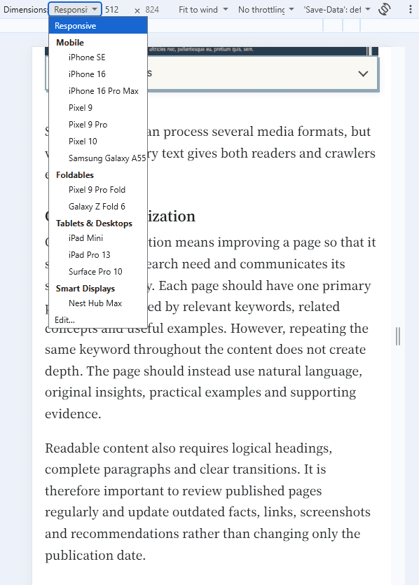
In Chrome: (Windows/Linux) Ctrl + Shift + I → Ctrl + Shift + M
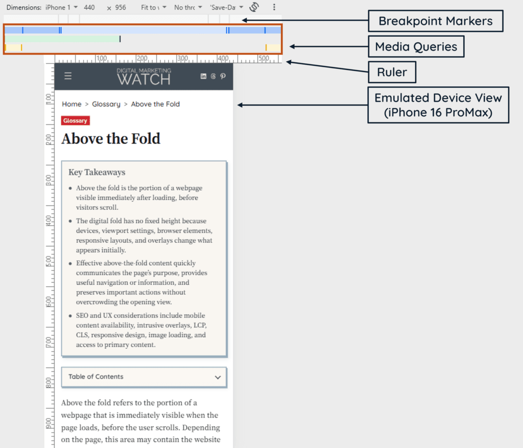
The first shortcut opens DevTools, while the second activates the device toolbar. Test several phone, tablet, and desktop widths, switch between portrait and landscape orientations, and watch for overflow, broken navigation, unreadable text, misplaced images, and unexpected layout shifts.
Note
Chrome Device Mode is useful for quickly testing viewport sizes and breakpoints, but it is still an approximation of a real mobile device. Important layouts should also be checked on actual phones or tablets where possible, particularly for touch behavior, browser UI, and performance.
Frequently Asked Questions
What is the fundamental difference between responsive design and adaptive design?
Responsive design uses flexible layouts that continuously adjust as available space changes. Adaptive design generally switches between several predefined layouts designed for particular screen-size ranges.
Does a responsive website automatically satisfy Google’s mobile-first indexing requirements?
No. Responsive design makes maintaining equivalent mobile and desktop content easier, but important content, links, metadata, images, structured data, and other resources must still be accessible to Google. Google recommends responsive design but does not require it for mobile-first indexing.
What happens if a webpage does not include a viewport meta tag?
Mobile browsers may use a wider virtual viewport and scale the page down, making text and controls appear unusually small and causing the layout to resemble a compressed desktop page. Setting the viewport allows responsive CSS to work against the actual device width.
Can a responsive layout cause Cumulative Layout Shift (CLS) errors?
Yes. Responsive design does not prevent CLS automatically. Images without reserved dimensions, advertisements, dynamically inserted content, web fonts, and other elements can still move content unexpectedly while the page loads. Specifying image dimensions or reserving space with an appropriate aspect ratio can help prevent these shifts.
How do I make large, multi-column tables responsive on mobile screens?
Simplify or reorganize the table when doing so preserves its meaning. When all columns must remain available, place the table inside a container with overflow-x: auto so users can scroll the table horizontally without forcing the entire webpage to scroll sideways.