How to Improve Content Structure and Readability
Key Takeaways
- Content structure and readability work together: organization helps readers navigate, while clear writing helps them understand the information.
- Descriptive headings, logical sequencing, tables of contents, and URL fragments help readers locate specific information within longer content.
- Chunking, BLUF, and inverted-pyramid writing manage complexity by grouping related ideas and presenting essential information before supporting details.
- Readability tools, lists, tables, visuals, and formatting should support audience needs and content purpose rather than replace editorial judgment.
Quality content can be accurate, well-researched, useful, relevant, and written to meet the needs of its intended audience. However, even strong content can remain incomplete if readers find it difficult to navigate, follow, or understand because the information is poorly organized or presented.
Content structure and readability address this problem from two directions. Structure determines how information is organized and how readers move through it, while readability determines how easily they can understand that information once they reach it. The two therefore work together. Shortening sentences without fixing a confusing hierarchy will not solve every problem, just as a perfect table of contents cannot rescue unclear writing.
These improvements also form part of broader content optimization, which refines how a page is organized, presented, and connected to related information for both readers and search engines. Google, for example, specifically notes that people generally appreciate content organized through paragraphs, sections, and headings that provide a clear structure. The W3C structure guidance similarly explains that well-structured content can improve navigation and processing, including for people using screen readers, keyboards, or assistive technologies.
In other words, content structure should not be treated as decoration added after writing. It is part of how information is communicated.
Table of Contents
Why Content Structure and Readability Matter?
Readable content helps readers understand the message without making them work unnecessarily hard to decode the writing. Well-structured content makes it equally easy to understand how the different parts of the page relate to one another.
Consider a 3,000-word guide containing ten useful sections. If the article begins with a long introduction, contains vague headings such as Other Factors and More Information, and presents every idea in similarly sized paragraphs, readers may have difficulty finding the particular answer they need.
The underlying information may be good. The presentation makes it less useful.
A stronger version might provide a table of contents near the beginning, arrange sections in a logical sequence, use descriptive headings, present the most important information early, separate complex ideas into manageable units, and use tables or visuals only where they communicate something better than prose.
How Content Structure and Readability Support Accessibility
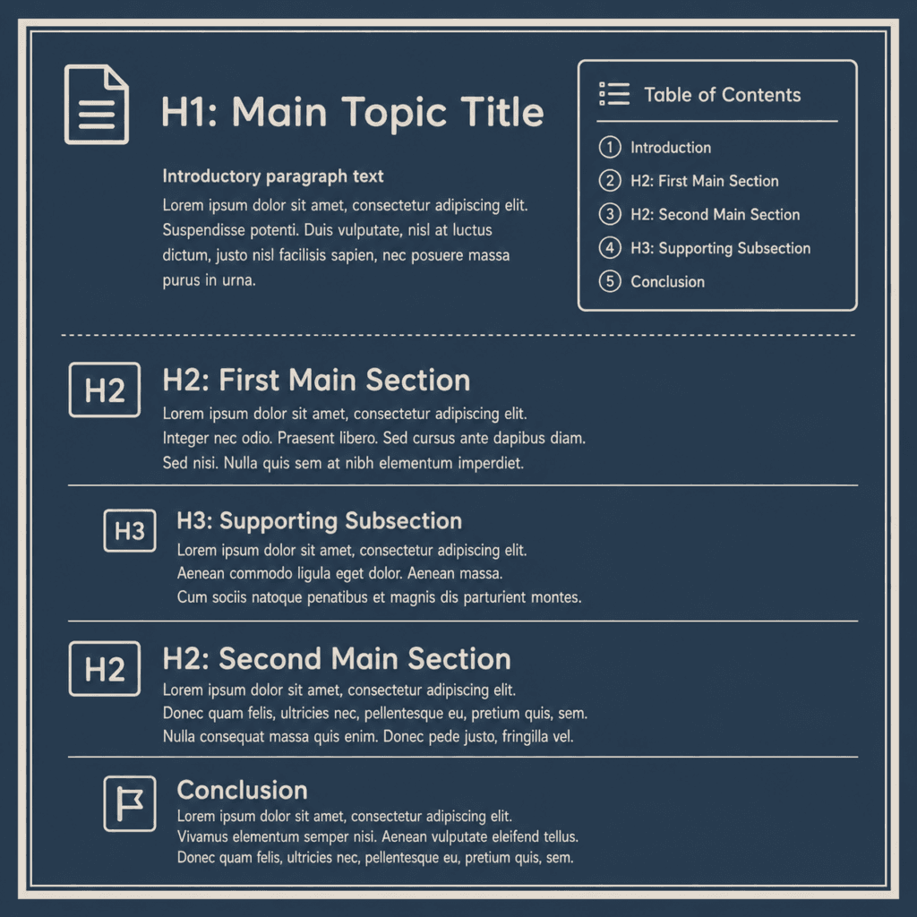
Content structure also has an accessibility dimension. The W3C explains that headings, paragraphs, lists, and other structural elements help people understand relationships, navigate content, and process information. It also notes that consistently styled paragraphs improve text readability, while appropriate list structures provide orientation for users.
This does not mean every article needs a complicated accessibility framework. It means that basic editorial choices—clear sections, logical order, meaningful headings, paragraphs, and correctly used lists—can support both general usability and accessibility.
The practical objective is therefore straightforward: help readers reach the right information, understand it, and know how it relates to the rest of the page.
Build a Clear Content Hierarchy and Navigation System
Content hierarchy establishes the order and relative importance of information. A reader should be able to look at an article and understand what the main subject is, which major ideas support it, and where more specific explanations belong.
Headings are an important part of that hierarchy, but this article is not about repeating the technical H1–H6 rules of on-page SEO. From a content perspective, the more important question is whether headings accurately describe the sections that follow and whether the sequence of those sections makes sense.
The W3C heading guidance explains that headings communicate the organization of a page and can also support in-page navigation through browsers and assistive technologies.
For example, an article about choosing an espresso machine might progress from Types of Espresso Machines to Important Features, Home vs. Commercial Machines, Cost Considerations, and finally How to Choose. Moving abruptly from cost to cleaning, then back to machine types, would make the page harder to follow even if every individual section were well written.
Using a Table of Contents for Longer Content
A table of contents can provide a visible map of the article before readers begin moving through it. This becomes particularly useful when an article contains several substantial sections or when visitors are likely to arrive looking for one specific answer rather than reading from beginning to end.
In WordPress, for example, the Rank Math Table of Contents block can automatically create linked entries for headings. When a reader selects one of those entries, the page moves directly to the corresponding section. Rank Math also allows heading anchor links to be edited when greater control is required.
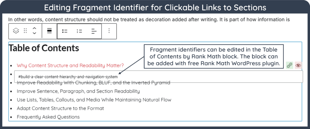
This creates a second benefit that is easy to overlook. Suppose an article contains a section titled:
How Readability Scores Work
A direct link to that section might look like: example.com/readability-guide/#how-readability-scores-work
The #how-readability-scores-work portion is technically called a fragment identifier or URL fragment. It allows a link to point to that particular location on the page rather than merely opening the article at the top.
This can be extremely useful when citing a specific fact, number, definition, table, or explanation from another article. Instead of linking readers to a 4,000-word page and expecting them to find the relevant information themselves, an internal or external link can take them directly to the section containing the supporting information.
It is therefore useful to think of a table of contents not only as a list at the top of an article, but as part of the page’s navigation system.
Using Descriptive Headings
A heading should communicate what readers will find underneath it. For example, compare the heading Other Considerations with Accessibility and Readability.
Here, the second heading gives readers substantially more information before they read the section. Similarly, More Information About Coffee says very little, while How Grind Size Affects Brewing establishes both the subject and the relationship being explained.
Google’s own documentation style guidance recommends descriptive headings because they help readers navigate both the page and their browser.
In short, headings should reduce uncertainty rather than simply divide a long page into visually smaller pieces.
Improve Readability With Chunking, BLUF, and the Inverted Pyramid
Good structure determines where information belongs. The next challenge is deciding how much information readers should encounter at once and in what order.
For this, three useful approaches are content chunking, BLUF, and inverted-pyramid writing. Although closely related, they solve slightly different problems.
Content Chunking for Managing Complexity
Content chunking means breaking a large body of information into smaller, meaningful units that can be understood independently while still contributing to the larger subject. A chunk might be a paragraph, subsection, table, example, process step, or visual explanation.
The important word here is meaningful.
Breaking every paragraph into one sentence does not automatically improve readability. In fact, excessive fragmentation can make an article feel mechanical because connected thoughts are separated before they have been properly developed.
A better approach is to group closely related ideas together. One paragraph might explain what readability means, the next could explain why sentence length alone is insufficient, and a third could introduce readability scores.
This way, each paragraph performs a distinct job without becoming isolated from the larger argument.
Use BLUF When the Answer Should Come First
BLUF stands for Bottom Line Up Front. The technique, commonly associated with concise government and military communication, places the central answer or recommendation before supporting context.
Suppose the question is:
A BLUF-style opening might say:
The following paragraphs can then explain when a ToC helps, when it adds unnecessary clutter, and how section links work.
This is often better than spending several paragraphs explaining the history and purpose of tables of contents before finally answering the reader’s question.
However, BLUF should not become a rigid formula for every paragraph. Opinion pieces, narratives, case studies, and analytical reports sometimes need context before the main interpretation becomes meaningful.
Use the Inverted Pyramid for Priority
The inverted-pyramid approach similarly places the most important information early, followed by supporting details, explanation, and less essential context.
This structure is particularly useful when readers may stop before reaching the end. A definition page, news-style explanation, product comparison, or troubleshooting guide often benefits from providing the essential information quickly.
A section explaining a Google Search change, for example, might begin with what changed and who it affects, then explain how the feature works, provide supporting details, and finally add background.
The principle is not that every piece of content must become shorter. Rather, importance should influence order.
BLUF asks, “What does the reader need to know first?” The inverted pyramid asks, “What information becomes progressively less essential as the section continues?” Content chunking then determines how that information should be divided into digestible units.
Used together, these methods can substantially improve clarity without making the article feel formulaic.
Improve Sentence, Paragraph, and Section Readability
Once the structure is sound, readability becomes a sentence- and paragraph-level concern.
Sentence Length Matters, But Clarity Matters More
Long sentences can become difficult to follow when they contain too many clauses, ideas, qualifications, or parenthetical explanations. However, short sentences are not automatically better.
Consider this passage:
Here, every sentence is short, and the writing sounds mechanical. A more natural version is:
The goal is therefore not to reach an arbitrary sentence length. It is to make sure the reader can follow the thought without having to reread it.
Sentence variety also matters. A paragraph containing one longer explanatory sentence followed by a shorter conclusion often feels more natural than four sentences built from the same pattern.
Build Paragraphs Around Connected Ideas
Paragraphs should group sentences that perform the same general function.
For example, the first sentence may introduce a problem, the next two can explain it, and the final sentence may establish the consequence or transition to the next idea.
Excessively long paragraphs can make dense information visually intimidating. At the opposite extreme, a sequence of one-sentence paragraphs can make thoughtful writing resemble social-media copy or machine-generated fragments.
There is no universal ideal paragraph length. The W3C content guidance simply emphasizes using paragraph elements to mark paragraphs consistently, noting that this improves readability and gives users more control over presentation. In other words, paragraph breaks should follow changes in thought, not a fixed word count.
Improve Content Structure and Readability Through Sections
Sections should also feel connected. For example, if one section explains sentence readability and the next introduces readability scores, the transition might say:
That sentence tells readers why the next section exists.
Without such transitions, an article may contain good information but still feel like independent blocks placed one after another.
Use Readability Scores Carefully
Readability tools commonly use formulas such as Flesch Reading Ease or Flesch-Kincaid Grade Level to estimate reading difficulty. These can be useful for identifying unusually complex writing, but they should not become targets that override editorial judgment. For example, a technical article written for experienced developers may legitimately require more complex terminology than a beginner guide. Therefore, readability should always be judged in relation to the intended audience.
A study of Flesch formulas found that such formulas can provide information about potential reading difficulty but they do not account for factors such as layout, images, charts, prior knowledge, motivation, or several aspects of writing style. Another study has similarly noted that traditional readability formulas do not fully capture text organization, fluency, conceptual complexity, or actual reader comprehension.
This matters because writers can sometimes improve a numerical readability score by shortening words and sentences while making the explanation less precise.
For example, replacing an essential technical term simply because it contains several syllables may make the score look better while making the content less useful to the intended audience.
Readability scores should therefore function as warning lights, not destination coordinates. If a score suggests that a paragraph is difficult, inspect the paragraph. Do not rewrite it mechanically just to reach a predetermined number.
Use Lists, Tables, Callouts, and Media While Maintaining Natural Flow
Formatting elements can make complex information much easier to understand. They can also make an article feel fragmented when they are used simply to break up text.
Use Prose When Ideas Need Explanation
If four ideas need to be compared only briefly, a sentence may be more natural than four bullets.
For example, instead of creating separate bullets for grammar, spelling, punctuation, and tone, a paragraph can simply explain that an editorial review should check grammar, spelling, punctuation, and consistency of tone.
Bullets become more useful when each item deserves independent attention, readers are likely to scan the items separately, or the list represents steps, requirements, alternatives, or a checklist.
The W3C recommends using different list types according to the nature of the information: unordered lists when sequence does not matter, ordered lists for sequential information, and description lists when terms need corresponding explanations.
In other words, lists should reflect the structure of the information, not merely provide visual variation.
Use Tables for Relationships and Comparisons
Tables work particularly well when readers need to compare the same attributes across multiple options.
A review of three email platforms, for example, could compare price, automation features, audience limits, integrations, and support in a table. Writing the same information in five separate paragraphs would force readers to remember each detail while moving between products.
However, a table is usually a poor choice for nuanced explanations or ideas that require context.
The W3C notes that properly structured data tables allow meaningful relationships in the data to be understood even when someone cannot visually rely on the grid itself.
Use Callouts for Genuinely Important Interruptions
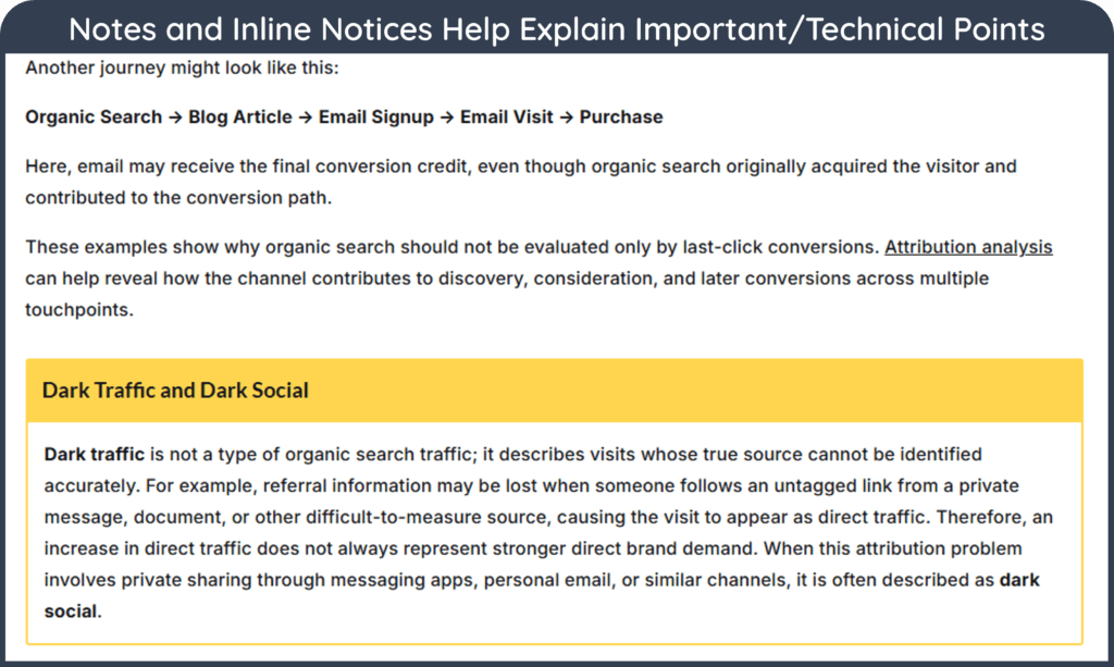
Notices, tips, warnings, and definitions can help when a point deserves special attention.
A useful callout might address a common misconception:
A callout becomes less effective when every few paragraphs contain one. If everything is highlighted, nothing feels particularly important.
Blend Visuals Into Your Content
Images, screenshots, charts, diagrams, infographics, and video should contribute to understanding rather than simply occupy space between paragraphs.
The W3C notes that illustrations may help clarify text for people with reading disabilities and should be accompanied by appropriate alternative text. Google also recommends high-quality images and video where they help users. It notes that multimedia can provide additional opportunities for discovery in its search experiences.
A screenshot is most useful when it demonstrates a process. A diagram can explain a relationship. A chart can communicate a trend. An infographic can summarize a framework.
Each visual should therefore answer a simple question:
What becomes easier to understand because this visual exists?
If the answer is “nothing in particular,” the visual is probably decorative rather than informational.
Adapt Content Structure to the Format
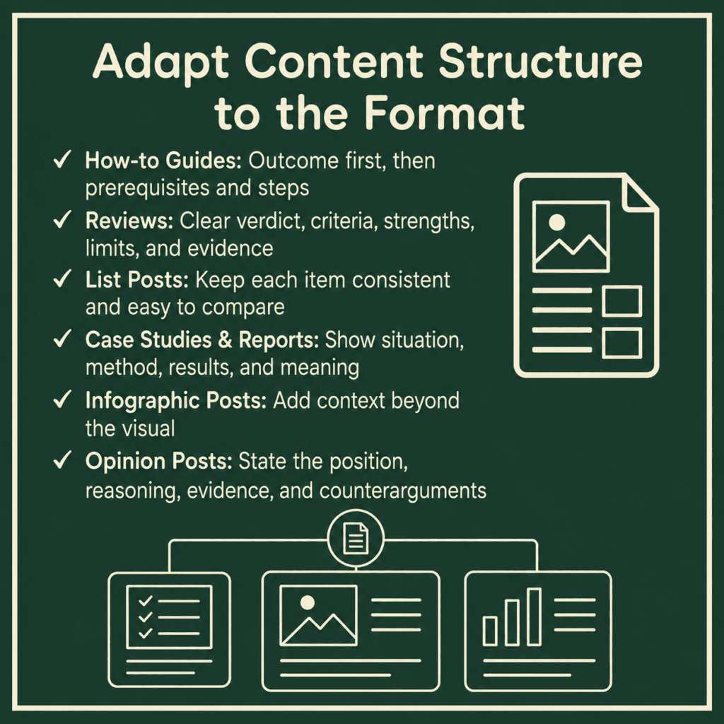
There is no single article structure that works equally well for every type of content. A good structure reflects what readers are trying to accomplish.
How-to Guides
A how-to guide should normally establish the intended outcome early, explain any prerequisites, and then move through the process in a logical sequence.
If the task is complex, numbered steps work well because sequence matters. Screenshots or illustrations can appear immediately after the step they clarify rather than being collected elsewhere on the page.
Troubleshooting information should also appear near the relevant step. Readers should not have to finish twelve steps before discovering that a common error occurs during step three.
Reviews
A review should help readers make a decision, so the verdict and evaluation criteria need to be clear.
A practical structure might begin with a concise summary, followed by who the product is suitable for, first-hand testing or experience, major strengths and limitations, important features, pricing context, alternatives, and a final recommendation.
The important point is that the article should demonstrate how the conclusion was reached, rather than simply listing specifications already available on the manufacturer’s website.
List Posts
List posts need more structure than a sequence of loosely related items.
If an article covers 10 Ways to Improve Email Deliverability, each item should answer roughly comparable questions. For example, each section might explain the technique, why it matters, how to implement it, and an important limitation.
Consistency helps readers compare items without forcing every section into exactly the same number of sentences.
Case Studies and Reports
Case studies usually benefit from a narrative progression because the result depends on what happened before it.
A useful structure may establish the initial situation, explain the problem, describe the approach or methodology, present the results, and then interpret what those results mean.
Reports should similarly distinguish findings from interpretation. Tables and charts can summarize data, but the surrounding prose should explain what the numbers do—and do not—show.
Infographic Posts
An infographic post should not simply display an image followed by several hundred words that repeat everything inside it.
The article should explain the context, ensure that important visual information has an appropriate accessible alternative, expand on the most important points, and provide supporting evidence or examples that could not fit inside the graphic.
This allows the visual and written content to perform complementary roles.
Opinion Posts
Opinion articles have more structural freedom because the purpose is often to develop an argument rather than answer a procedural question.
However, they still benefit from a recognizable progression. The writer should establish the position, explain the reasoning, acknowledge meaningful counterarguments where appropriate, provide evidence or experience, and show how those elements support the conclusion.
In short, structure should serve the format, audience, and purpose of the page rather than forcing every article into the same editorial template.
Conclusion: Content Structure and Readability
Content structure and readability work together to determine how easily readers can find, follow, and understand information. Clear hierarchies, descriptive headings, logical paragraphs, useful navigation, appropriate visuals, and natural sentence construction make content easier to use without forcing every article into the same format.
The goal is not to make every sentence short or every page highly structured. Instead, structure and readability should reflect the audience, purpose, complexity, and format of the content.
Frequently Asked Questions
What is content structure?
Content structure is the way information is organized into sections, paragraphs, headings, navigation elements, lists, tables, visuals, and other components so readers can understand how the ideas relate to one another.
Does every article need a table of contents?
No. A table of contents is most useful for longer or more complex articles where readers benefit from seeing the major sections and jumping directly to the information they need.
How do content structure and readability affect SEO?
Content structure and readability can help users navigate and understand a page more easily. Clear headings, logical organization, readable paragraphs, and useful navigation also help search engines interpret the content, although there is no single Google ranking factor called “content structure and readability.”
What is a URL fragment?
A URL fragment is the portion beginning with # that points to a specific location within a webpage, allowing readers to open the page directly at a particular section.
What is content chunking?
Content chunking is the practice of dividing complex information into smaller, meaningful units such as paragraphs, subsections, steps, tables, or examples without breaking apart ideas that naturally belong together.
What is the BLUF writing method?
BLUF, or Bottom Line Up Front, presents the main answer or recommendation before the supporting explanation so readers can understand the essential point quickly.
What is inverted-pyramid writing?
Inverted-pyramid writing organizes information from most important to progressively less essential, allowing readers to receive the core message even if they do not read the entire section.
Is a higher readability score always better?
No. Readability formulas can identify potential complexity, but they do not fully measure comprehension, context, expertise, layout, visuals, or the needs of the intended audience.
Are short sentences always easier to read?
No. Short sentences can improve clarity, but excessive use of them can make writing fragmented or mechanical; sentence structure should instead match the complexity of the idea being explained.